magazine advertizement project
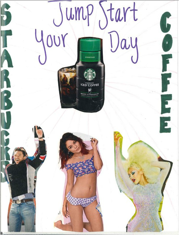
In this project, I created a magazine add out of a few different pictures from different magazines. My add is advertizing Starbucks iced coffee and reads, "Jump Start Your Day" with people jumping at the bottom of the page. The add is promoting that this Starbucks coffee will wake you up and help to start your day.
While creating the advertisement we had to focus on certain principles and elements. The elements were line and color. I used the element of color through the different colors in the add because they are bright and pop out which goes with the theme of "waking up." Next I used line through the lines starting from the edges of the pages leading to the Starbucks in the center. The lines lead a path to the main advertisement. I used the principle of emphasis through the lines as well. The lines create emphasis leading to the Starbucks. Lastly, I used balance by balancing words on each side of the page and having the three jumping people split the center.
From doing this project I have learned how tricky it is to come up with a new add.
Flyer assignments
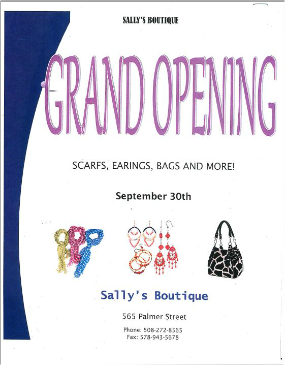
This flyer is a wind shield flyer advertising the grand opening of a boutique. I used color and line as the border goes along with the "G" in "Grand Opening."
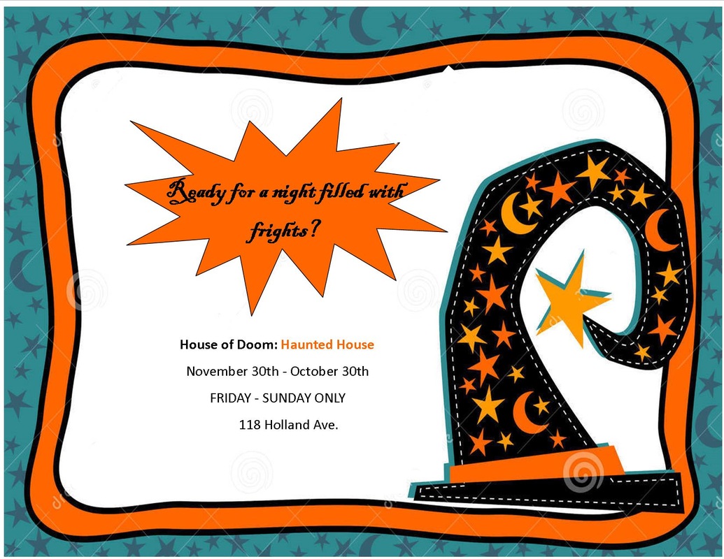
This flyer is a colored flyer advertising a haunted house during the month of October.
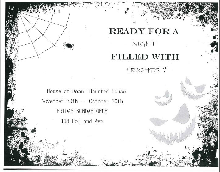
This flyer is advertising the same haunted house as the previous, but now it is in black and white has a different design.
COMPANY BROCHURE
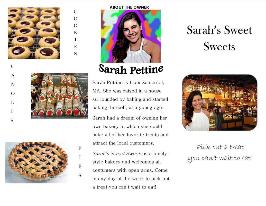
In this project I had to create a brochure for a made up company that I own. My company is Sarah's Sweet Sweets. It is a bakery that I "own" and in the brochure I created a mini biography about myself as the owner. Along with the biography is a picture of me. To create the picture I uploaded it into Photoshop and used different effects to make it look like a painting instead of a photograph.
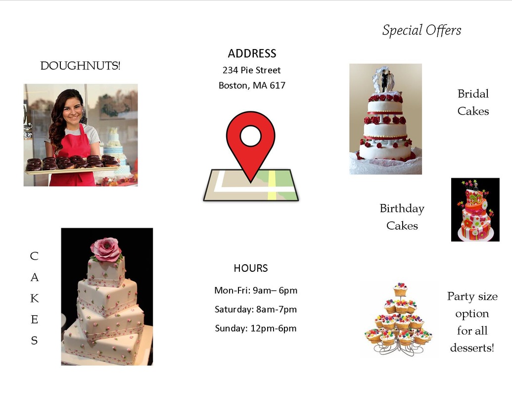
Throughout the brochure I included pictures of me Photoshopped into a bakery, and a picture of me Photoshopped into a picture of me holding doughnuts. I used Photoshop to put my face into these two pictures.
After completing this project I learned how to use Photoshop and how to create an interesting brochure. My use of pictures and text placement makes the brochure easy to read and also causes the reader to want to try my desserts.
|
|
GREETING CARD

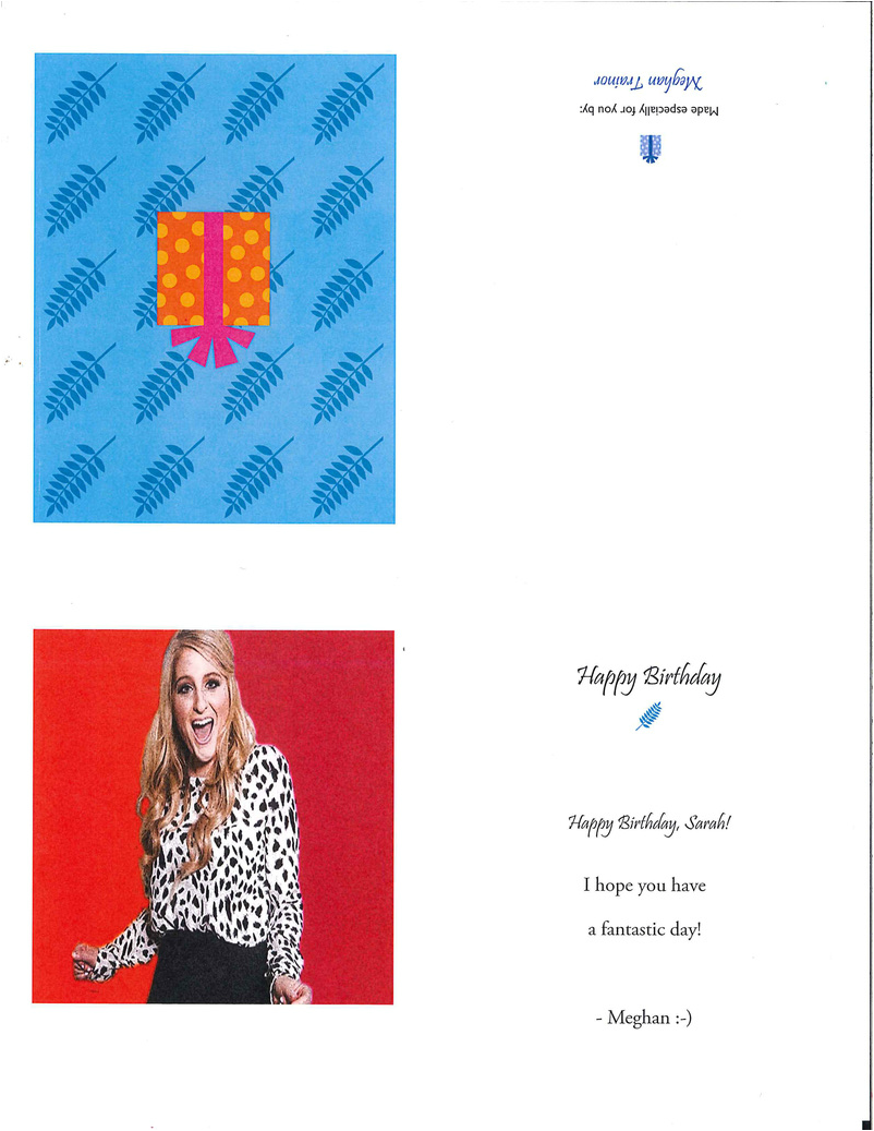
In this project I had to create a greeting card from a celebrity to me. I chose Meghan Trainor. I had to take an image of her and use tools in Photoshop to edit the image. First I cropped the photo, then I painted the background pink and orange. I also used an effect tool that made the image look dotted. After that I brightened the image, then increased the contrast.
Next, I put the image on a greeting card that read: "Happy Birthday, Sarah!" I addressed the card from Meghan Trainor.
From completing this project I learned how to use more/new techniques on Photoshop.
Next, I put the image on a greeting card that read: "Happy Birthday, Sarah!" I addressed the card from Meghan Trainor.
From completing this project I learned how to use more/new techniques on Photoshop.
Thayer street brochure
|
|
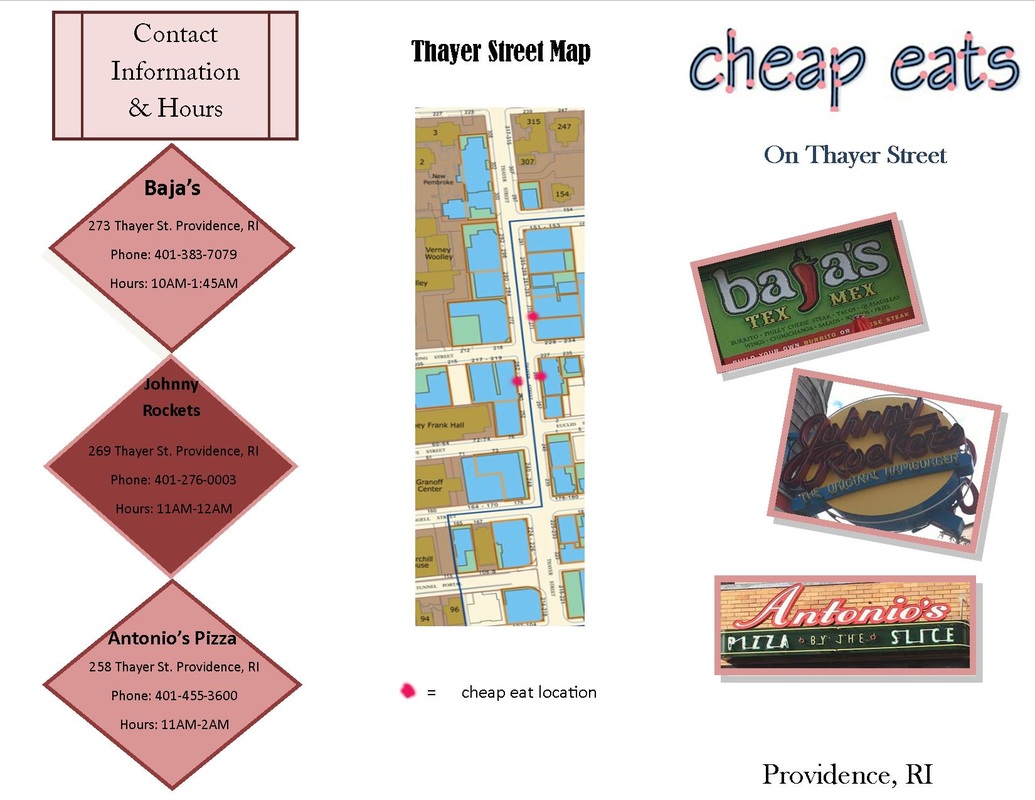
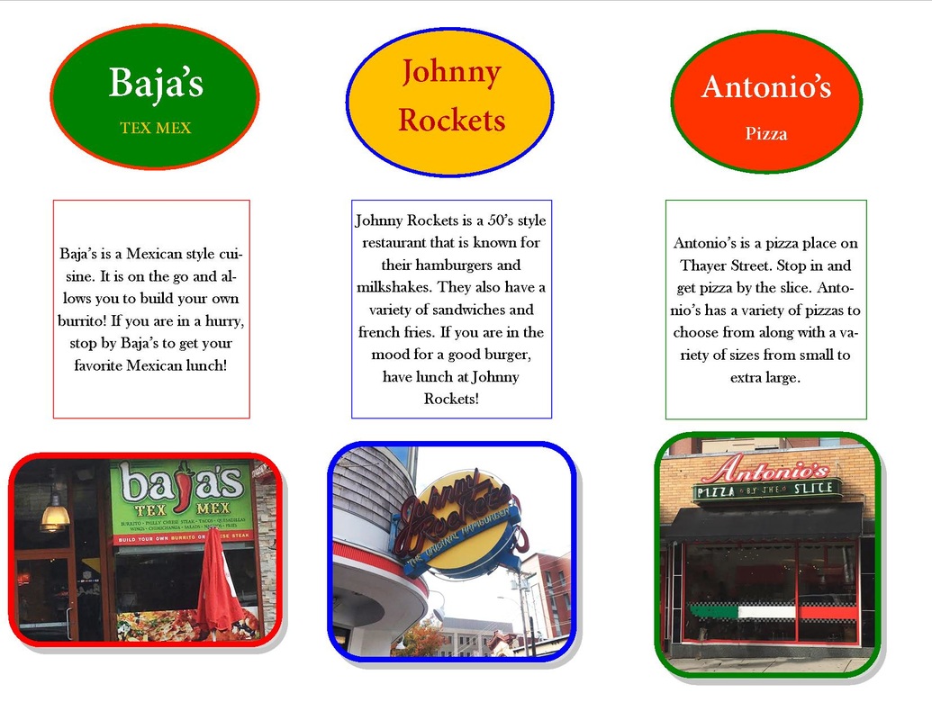
For this project we had to create a brochure for a certain type of business on Thayer Street located in Providence, Rhode Island. We were assigned a category for every group of four students. My group's category was "cheap eats." After were were assigned our category, we went to Thayer Street and walked around, taking pictures of businesses considered "cheap eats." We found Baja's, Johnny Rockets, Mike's Calzones, Antonio's, and Sushi Express. Along with the picture, we had to find out store hours and addresses of each cheap eat.
For my brochure the three cheap eats I chose were Baja's, Johnny Rockets, and Antonio's. The cover of my brochure has a title that I edited in Photoshop. I first made the title in Word Art then I saved it in Photoshop and made the text have an effect and I drew dots onto the words. Each photo on my brochure also was edited in Photoshop. I cropped all of them and then I brightened the Johnny Rockets sign to make it easier to read. On my brochure I also added borders to the photos. On the inside, the border of the photo corresponds to the colors of the restaurants' themes.
Overall, I enjoyed this project. I had fun walking around on Thayer Street with my group. My favorite part was eating lunch at Johnny Rockets. This project helped me use Photoshop more and also showed me how to make a brochure.
